Progressive cognition: the slow reveal of complexity through user action

The term “progressive disclosure” has been around since the 1980s, and is widely used and understood. It relates to the practice of moving advanced or rarely used features away from the primary interface to a secondary interface, and then gradually revealing those features to users as they progress through a series of steps. The intention is to simplify the initial experience (eg for novice users), reduce up-front cognitive load and prevent overwhelm.
‘Progressive disclosure’ vs ‘progressive cognition’
In some cases, though, there’s more to consider than just simplifying the user interface, or providing access to advanced or complex features. Often, you’re trying to teach users what’s possible and increase discovery and learnability of features. In these cases, reframing ‘progressive disclosure’ as ‘progressive cognition’ encourages focus on the user’s perception and on building their mental model, and this then drives what you disclose at each step (rather than, say, the inherent complexity of the interface).
Signalling the proposition
The general tenet is here is to start simple and move toward complexity.
The initial step should give users a hint at what’s possible, and signpost the first step on that path (I call this ‘signalling the proposition’). That first step should be easy to take, with a limited number of choices and intuitive UI elements. Each subsequent step should then only reveal a manageable amount of new information, reinforcing and building on the user’s previous understanding and mental model.
You may well end up with a fairly complex UI, but because the user has ‘driven’ the path through intuitive decisions they’ve made along the way, they’re more likely to have a better understanding and feel less overwhelmed.
How you signal the proposition at that first step requires careful consideration. What you give away pre-interaction can communicate strong messages to users about:
- the complexity of the feature
- the importance of the feature
- the potential value of the feature to the user (the ‘reward’)
- how you model and prioritise information.
Let’s look at an example.
Consider an online repository of information - maybe a website news section, or blog, or list of products - a series of items that can be filtered by the user to show a subset of those items. There are a number of ways that the filtering feature could be presented to users - the examples below are all first-step (pre-interaction) states.
Icon only

- ‘Quiet’ UI - likely to be missed; suggests feature is low importance and low value
- Doesn’t suggest anything about the complexity of the feature or how you model information until after it’s clicked
‘Add a filter’ button

- Slightly ‘louder’ - suggests that filtering is something users might benefit from, but not a key feature
- Still doesn’t communicate anything about the complexity of the feature or how you model information until after it’s clicked
Simple list

- Now we’re surfacing a small number of available filters
- Suggests that the feature and underlying taxonomy is simple, and that there are a limited number of items in the repository
- Communicates how you’ve decided to structure and categorise the underlying taxonomy - the things you think are important
Simple list + ‘more’

- Suggests that there is greater complexity to the underlying taxonomy than the three items shown, but you have to click the ‘More’ button to discover that complexity
- Communicates that those three things are the most important or valuable things you might want to filter by
- For a blog, it would communicate that ‘these are the things we largely blog about’
Category dropdowns

- Suggests a greater level of complexity to the underlying taxonomy, but communicates how that taxonomy is structured
- Suggests a greater number of items in the repository, which in turn suggests a greater level of value to the filtering
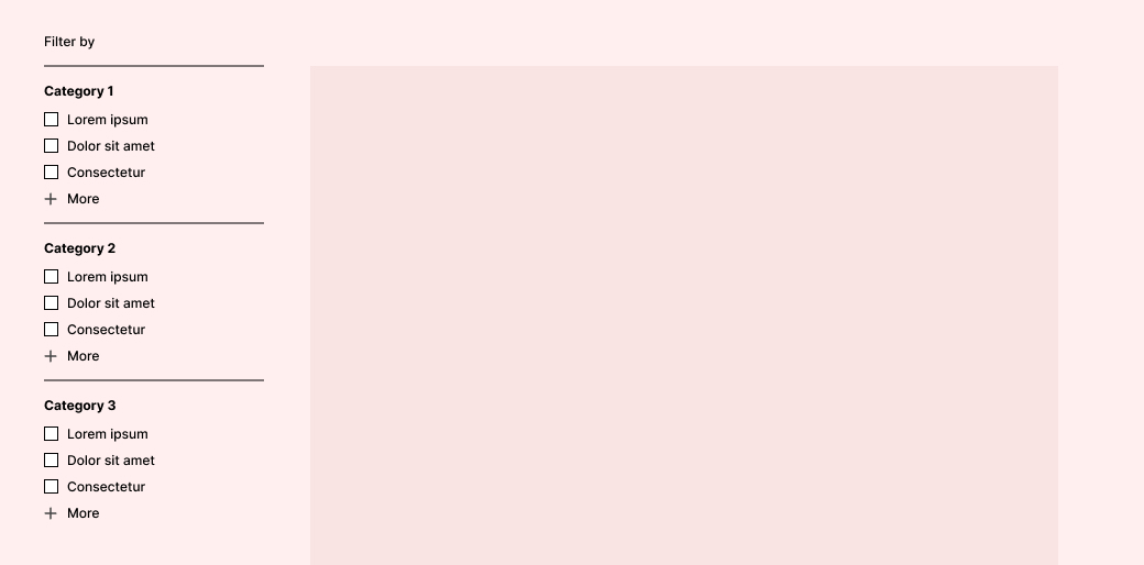
Checkboxes

- ‘Loud’ UI - implies that this is a key feature, and that there are probably many items in the repository
- Communicates a complex taxonomy structure, but implies greater value to the user
- Communicates the most valuable items in each category, with more items behind the ‘More’ link in each case
Avoid dead-ends
As with any multi-step process, it’s important to make every effort to avoid dead-ends, forcing users backwards in the process.
In the example above, if users need to be able to filter the repository by multiple filters, make sure that they’re not able to run into ‘zero matches’. You could do this in a couple of different ways:
- Return all items that match ANY of the selected filters (A OR B, rather than A AND B) - so the first selection narrows the list, and subsequent additional selections widen it again
- If you want to match on ALL the selected filters, then after each filter is activated, remove or disable any remaining filters that would result in zero matches if selected next.
Comments
Loading comments…
Leave a comment
Markdown is supported.